
Lists
Every data object class has a list – Tours, Properties, Agents… Open one from the menu.
Columns
A list always shows the image (when the class has one), the name, when it was last changed and its publication (Published or Draft). The other columns come from the class – admins choose them in Customize. Where nobody has chosen, a list shows 5 columns: the name, the status, Assigned to (where the list uses assignments) and the first fields of the class.
On a list with assignments, the Assigned to column is always shown – also when you or an admin chose the columns before it existed. It goes away only when you switch it off in Columns.
Short columns – codes, statuses, people – always show their whole value. When the list runs out of room, the name column gives way first and long names end in "…" (hover a name to read it in full).
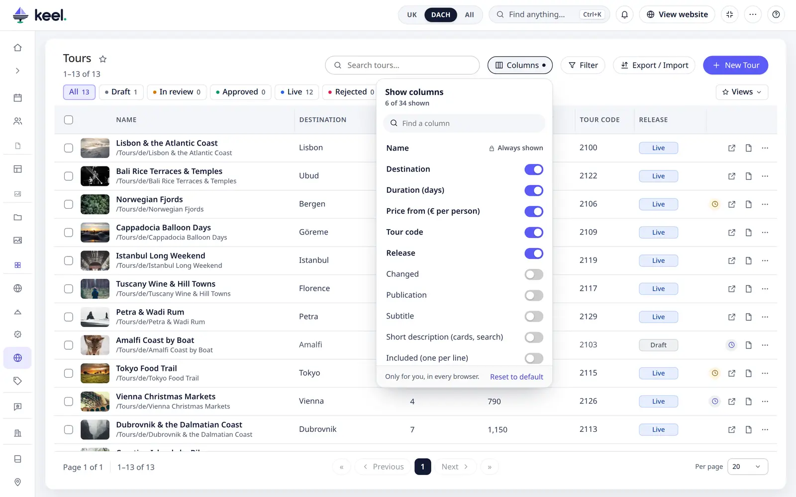
- Columns – the button above the list (next to the search; Pimcore Studio only) lets you show or hide columns for yourself. The name always stays. Your choice is remembered per list, with your user. Reset to default goes back to the admin's columns. Other users are not affected. The classic admin dashboard has no such button.
-
Filter – the button next to Columns finds items by what is in a field, and Views saves a setup under a name. More
-
Export – the button next to Columns downloads the list as an Excel or CSV file: this view or the rows you ticked, the visible columns or all fields. More In lists where you may save, it is called Export / Import and also brings an edited file back. More
Column titles are centred above their column. Values, numbers included, are left-aligned in every column; numbers use your language's thousands separator (2,690 in English, 2.690 in Croatian and German).
- Sort – click a column title: ascending, then descending, then back to the default. The sorted column's title is bold, with an arrow.
- Resize – drag the line at the right edge of a column title. Double-click the line to return to the automatic width. Widths are remembered per list.
Search and filter
- Search – the box at the top (/). Every word must match. When the project has Pimcore's search index, small typos and word beginnings work too (Marlinn and mar both find Marlin) and the best matches come first. More
Above the list there is one row of chips. Each chip shows how many items it has.
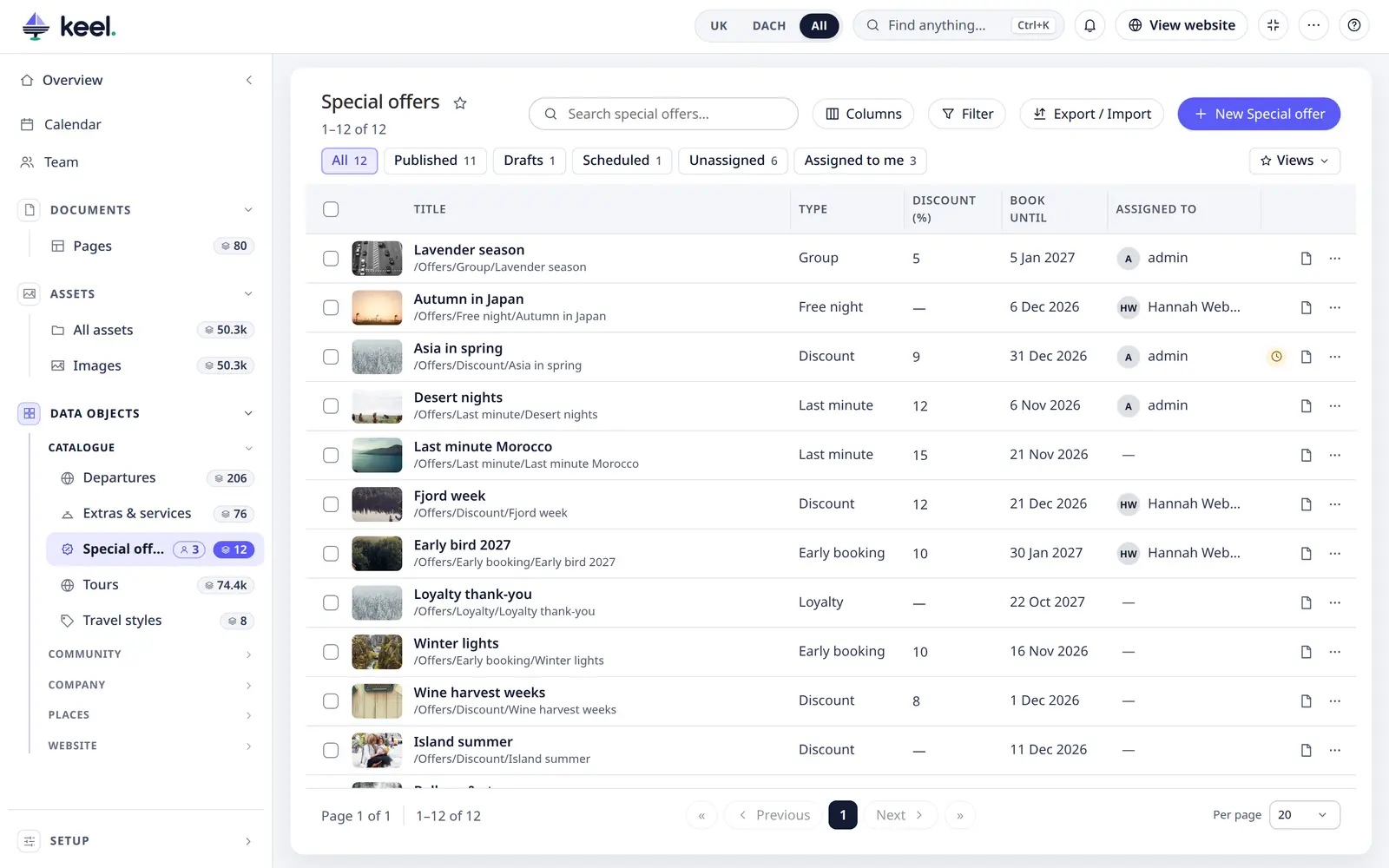
- All · Published · Drafts – on lists without a status field.
- Status chips (and tabs) – on lists with a status field: see Statuses. There, Published and Drafts are not chips: use the Filter panel, field Publication.
- Scheduled – items with a planned publish or unpublish (Scheduled publishing). The chip appears when at least one item has one.
- Unassigned and Assigned to me – on lists with assignments: only the items nobody is assigned to, or only the items assigned to you or one of your teams.
Scheduled, Unassigned and Assigned to me sit at the end of the same row as the status chips. On a normal status list they combine with the status you chose: In progress and Assigned to me shows your items in progress. On a workflow list one chip replaces the other.
Statuses
Lists with a status field – for example Enquiries with New, In progress, Closed – show each item's status as a coloured label, always with its name. Admins choose the field, the colours and which statuses count as closed in Customize; without a status field the list looks as described above.
- Tabs – when some statuses count as closed, the list has two tabs: Open (where it starts) and a tab named after the closed status, for example Done 33 – or Closed when several statuses count as closed. Items with a closed status are only in that tab. Arrow keys move between the tabs.
- Status chips – next to the tabs, one chip per status of the active tab with its number of items. Click a chip to see only those items; click it again to see the whole tab.
- No status – items whose status is empty are counted under No status in the Open tab, and you can filter them like any other status.
- A status that was removed from the class but is still stored on some items shows as a grey label with its stored value, and has its own chip.
- If every item with a status has a closed one, the list opens on the closed tab; the Open tab then says Nothing is open.
- The coloured labels appear in the rows when the status field is one of the list's columns; the tabs and chips work either way.
- Lists shown as a tree (items inside items, below) have no status tabs or chips, except the one row of a workflow list.
- The status filter works together with Scheduled, Unassigned and Assigned to me (assignments) and with the Publication filter: they show only the items that match both, and their numbers follow the active tab and status.
Workflow lists
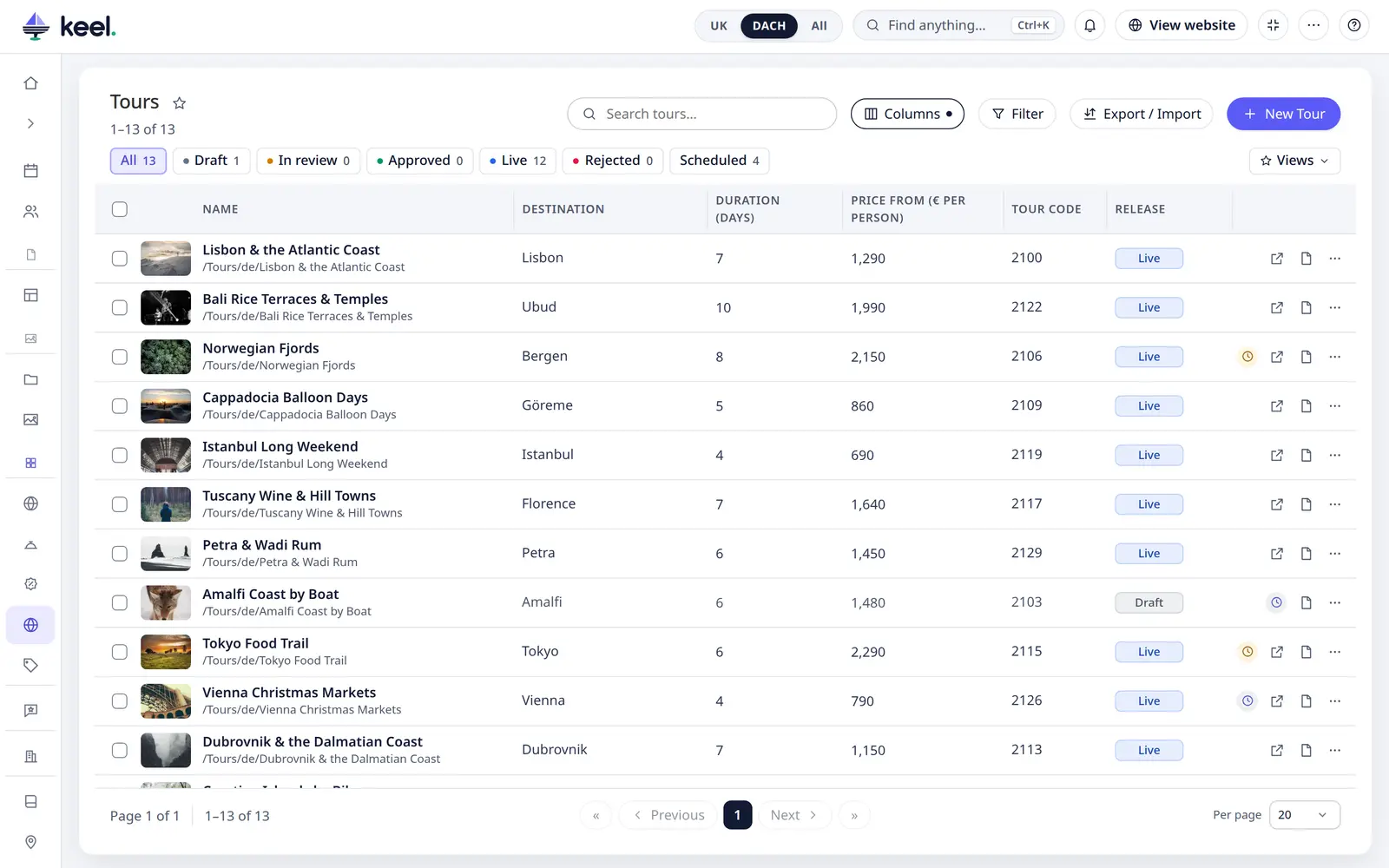
When the status comes from a workflow, for example Tours, the list has one row of chips and no tabs: All · Draft · In review · Approved · Live · Rejected, in the workflow's order, each with its number of items.
- Every place is a normal chip, Rejected too. There are no Open and Rejected tabs.
- Scheduled (when something is scheduled), Unassigned and Assigned to me (on lists with assignments) are chips in the same row.
- One chip at a time: a chip replaces the one chosen before, and each chip's number is the number of rows it shows. Click the chosen chip again, or All, to see the whole list. The list, Select all matching, bulk changes and Export follow the chosen chip.
- Published and Drafts are not chips here, so Draft always means the workflow's place. To filter by Pimcore's published state, use the Filter panel: field Publication, Published or Not published. It combines with the chips.
- A saved view from before keeps working: the closed tab becomes the chip of the closed status (which can honestly be empty, as the tab was), Published and Drafts become the Publication filter. What has no place in the row, such as a status together with Assigned to me, is left out and a small note under the toolbar says so.
Changes in Customize apply the next time the list is opened. In dark mode the labels use lighter shades of the same colours; the text stays readable in both.
Change a status from the list
On a list with a status field, click a status pill to open a menu of the statuses, each in its colour (the current one is ticked). Pick one and it is saved at once, like a normal save: the item gets a new version, and on lists with assignments the change goes into the status history. The row stays where it is until you refresh or change the list, so it does not jump away under the pointer, even if the new status belongs to the other tab. Esc closes the menu.
- The pill is a button only if you may save the item. Without the save right it is a plain label.
- On a published item you also need the publish right, because the change goes live. Without it the pill is not clickable.
- A status that a Pimcore workflow controls opens the item's workflow steps instead of the status menu.
- All status pills in a list have the same width, so the column stays tidy.
Pages
Lists are shown page by page, 50 rows to a page unless you choose another size: « first, Previous, the page numbers (1 2 3 … 14), Next, » last, and beside them Page 2 of 14 and 51–100 of 700. Choose Per page – 10, 20, 50, 100 or 200, unless the project offers other sizes – on the far right; Keel remembers your choice with your user, for all lists. Pages and the asset library use the same pager.
Items inside items (tree)
When items of a class are placed under each other in Pimcore (for example regions under countries), the list shows a tree: click the arrow to open or close a branch, or use Expand all / Collapse all. Add sub-item is in a row's ⋯ menu.
While you search, filter or sort, the tree becomes a flat list.
Variants
A class with variants lists its items. An arrow by the name opens the variants of a row. See Variants and inherited values.
Keyboard
The rows of a list are one tab stop: Tab moves into the rows and on past them to the pager.
- ↑ ↓, Page Up Page Down, Home End move between rows.
- → ← move through a row's controls (status, assignee, buttons); Esc goes back to the row.
- Space ticks the row, Enter opens it.
- Skip to results and Skip to pages links at the top of a list jump past the toolbar. After a search, a filter or a page change a screen reader hears how many rows are shown (1–50 of 2,666).
The focused row is outlined only when you use the keyboard; clicking with the mouse leaves no ring.
Open, add, view
- Open – click a row (or press Enter on it) to open the editor.
- Add – New … at the top, or press N.
- View on website and Open in the Pimcore editor – the icons at the end of a row, always shown. The row's ⋯ menu holds Delete (Keel asks first) and, on tree lists, Add sub-item.
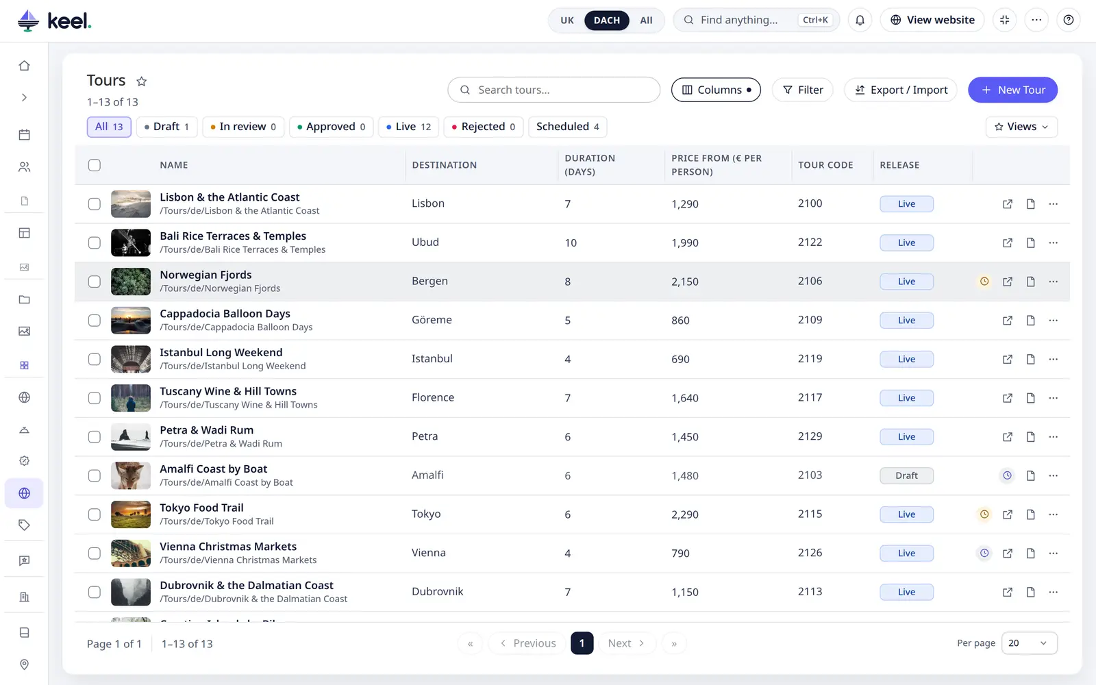
- Scheduled change – a row with a planned publish or unpublish shows a small clock at its end. Hover it to see what happens when; click it to open the item.
Compare
Tick two to four rows and click Compare in the bar at the bottom to see the items side by side, with the differences marked. See Compare items.
Big lists
Lists of any size – 50,000 items and more – are paged, searched, filtered and sorted on the server and stay fast.